

Cupology

1. Overview
Project Overview
Cupology is a mobile app concept designed to enhance the café experience by reducing wait times and enabling seamless pickup or delivery orders. With features like real-time order tracking and loyalty rewards, the app caters to modern consumers’ fast-paced lifestyles while fostering a sense of community.
01
Role
UX Designer
04
Location
Mumbai, India (Remote)
02
Project Type
Hypothetical Case Study – Google UX Design Certification
05
Date
September, 2024
03
Tools Used
Figma (design),
Miro (brainstorming),
Google Forms (research), Microsoft Teams (testing),
Notion (documentation)
Problem Statement
Local cafés often struggle with managing peak-hour traffic, leading to long wait times and dissatisfied customers. This impacts both revenue and customer retention.
Key Problem: How might we create an intuitive app that enables seamless order placement while building customer loyalty and enhancing the overall café experience?
Cupology Goals
Below are the key goals and their related pain points that shaped the design and development of Cupology, providing a focused approach to enhancing the café experience.
Pain Point
Cafés struggle to retain customers without effective engagement strategies.
.png)
Pain Point
Challenges faced by busy or remote customers.
Pain Point
Long queues and delays during peak hours.
Research
To build a truly user-centric solution, I focused on understanding both the frustrations and expectations of café-goers. By diving into user interviews and benchmarking leading apps, I aimed to uncover what works, what doesn’t, and where the opportunity lies to create a seamless and engaging café ordering experience. This research phase not only validated the need for features like real-time order tracking and rewards integration but also revealed gaps in existing platforms that Cupology could address.
Methodology
To ensure a well-rounded perspective, I combined qualitative and quantitative research methods, balancing user feedback with competitor analysis.
.png)
2. Goals & Research
Step 1: User Interviews
I conducted in-person interviews with seven participants, aged 18–60, selected to represent a diverse range of café customers, including professionals, students, and casual coffee drinkers. Interviews were structured around their typical ordering habits, frustrations, and expectations for a better experience.
Type: Semi-structured user interviews
-
I prepared 8–10 questions to guide the conversation but kept it flexible so I could explore any interesting topics or insights that came up. This helped me maintain a good balance between having structure and keeping things open for deeper exploration.
Participants: This included friends, family, and colleagues I’ve met through work.
Key Findings:
Long Wait Times
All 7 participants shared that they avoid cafés during busy times because long queues take away the joy of getting their favorite coffee—something I was determined to fix.
Visual Menus
4 out of 7 participants mentioned that without photos and detailed descriptions, they often felt unsure about their choices—something I knew needed to change.
Ease of Navigation:
5 out of 7 participants highlighted how a simple, intuitive interface could make ordering faster and less frustrating—a key focus for my design.
Remote Ordering:
6 out of 7 participants shared how pre-order and pickup options would save them valuable time during their busy routines, making this a top priority for the app.
After speaking with participants and uncovering their frustrations and needs, I wanted to understand how existing apps were tackling these challenges. Diving into competitor analysis gave me the opportunity to see what features were working well, where they fell short, and how Cupology could bring something new to the table
Step 2: Competitor Analysis
I analyzed popular apps like Starbucks, Third Wave Coffee, Uber Eats, and Zomato to understand their strengths and weaknesses. It was eye-opening to see what features users already valued and where opportunities for improvement existed.

What Works Well in Competitor Apps:
Competitor apps have some strong features that users already value. These include reliable delivery options, loyalty programs that encourage repeat visits, and robust functionality for order tracking. While these strengths cater to specific needs, they often excel in isolated areas rather than providing a cohesive experience. The detailed competitor analysis table above highlights how these apps address common café-goer pain points.
What Works Well in Competitor Apps:
Despite their strengths, many competitor apps fall short in areas critical to user satisfaction. Cluttered and unintuitive interfaces often frustrate users and make navigation cumbersome. Additionally, a lack of clear visuals, such as item photos and descriptions, leaves users feeling unsure about their choices. Features that balance both in-store and remote ordering experiences are also underdeveloped, creating gaps in customer engagement. These shortcomings represent significant opportunities for Cupology, as detailed in the comparison table ab0ve.
With user feedback and a clear understanding of where competitors were missing the mark, I wanted to validate my findings with a larger group. This led me to conduct surveys and create personas to bring the data to life.
Step 3: User Personas and Journey Maps
Using insights from the interviews, I created two detailed personas representing the key customer types Cupology aims to serve. Alongside these personas, I developed empathy maps and journey maps to visualize their current experiences and highlight opportunities for improvement.
Objective:
-
Present a clear understanding of user behaviors, motivations, and challenges.
-
Highlight how personas and journey maps guided user-centered design decisions.
-
Demonstrate opportunities for improving the café experience through tailored solutions.
Person: Paul

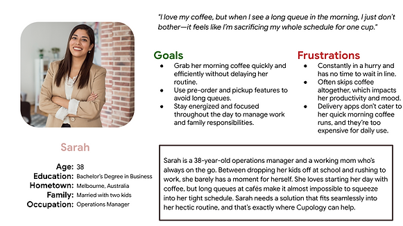
Person: Sarah
To dive deeper into the users' experiences and emotions, empathy maps were created for each persona, offering valuable insights into their thoughts, feelings, and challenges

.png)
To further visualize the users' interactions with networking resources, journey maps were developed. These maps highlight key steps, pain points, and opportunities for improvement, ensuring a comprehensive understanding of their journey

.png)
Key Insights
Queues Are a Barrier: Long wait times deter users like Paul and Sarah from visiting cafés. Pre-order and pickup options are essential.
Fits Into Routines: Busy users need features like scheduled pickups and real-time tracking to simplify their mornings.
Visual Menus Matter: Clear photos and descriptions build user confidence and encourage trying new items.
Simplified Ordering: A clean, intuitive interface reduces decision fatigue and makes ordering stress-free.
Loyalty Drives Engagement: Personalized rewards and offers keep users engaged and encourage repeat use.
From
Insights
Design
Using the rich insights gathered from user research, personas, empathy maps, and journey maps, the design process for Cupology began with one goal in mind: creating a seamless, user-centered café experience. The journey started with hand-drawn paper wireframes, moved to detailed low-fidelity prototypes, and culminated in polished high-fidelity designs. At each stage, usability testing was conducted—first on the low-fidelity prototype to refine functionality and user flows, and later on the high-fidelity prototype to validate the final design and ensure it aligned with user needs.
3. Design Process
1. Paper Wireframes
The design process began with hand-drawn paper wireframes, where I focused on translating initial ideas into basic layouts and flows. These sketches were an essential starting point, allowing me to explore the app's core features and overall structure while keeping things flexible and iterative.
The following screens were sketched:
Landing Page: Introduced a simple and welcoming screen with options to sign in or continue as a guest.
Login and Register: Designed straightforward forms for user authentication, ensuring ease of access.
Profile Page: Highlighted essential user details and streamlined access to past orders, rewards, and settings.
Homepage: Featured a clean layout with quick access to menu categories and loyalty points.
Menu: Prioritized intuitive browsing with clearly defined categories such as drinks, food, and featured items.
Item Details: Focused on providing key information like item descriptions, ingredients, and pricing in an intuitive layout.
Item Customization: Focused on an easy-to-navigate customization process, ensuring users could tailor their orders effortlessly.

2. Low Fidelity Prototype
Once the paper sketches felt solid, I moved them into Figma to create the low-fidelity prototype. This phase was all about structure and functionality—getting the user flow right before diving into aesthetics. Here’s what the low-fi prototype focused on:
.png)

Lo-Fi Prototype – At a Glance
In the low-fidelity stage, I expanded on the paper wireframes by:
Defining Key Navigation Flows: Ensuring users could seamlessly move between the landing, login/register, and core order screens.
Streamlining Customization: Adding structured steps to make item customization straightforward and user-friendly.
Clarifying Layouts: Using placeholder images and text to define spaces for content, ensuring a logical hierarchy of information across all screens.
Interactive Prototypes: Linking buttons and menu items for usability testing, enabling me to gather valuable feedback on user interactions.
3. Usability Testing - Round 1
I conducted usability testing with 5 participants, including professionals, students, and casual café-goers, to validate the app's navigation and core functionality. The sessions focused on tasks like pre-ordering, browsing the menu, and customizing items, helping identify key areas for improvement.
Key Findings:
-
Vague homepage labels caused hesitation.
-
Menu categories lacked hierarchy, slowing navigation.
-
Customization icons were unclear, leading to confusion.
.png)
4. High Fidelity Prototype
After refining and validating the low-fidelity prototype through usability testing, I moved to the high-fidelity design phase. This stage focused on adding visual polish, branding, and interactive features while addressing earlier usability issues. Warm café tones like espresso browns and soft neutrals were incorporated to create an inviting aesthetic and enhance the user experience.
These are the key areas I focused on for the hi-fi:
.png)

Hi-Fi Prototype – At a Glance
In the high-fidelity stage, I built upon the insights and refinements from the low-fidelity prototype by focusing on both aesthetics and functionality:
Creating a Cozy Visual Identity: Designed a cohesive color palette inspired by café tones—espresso browns and soft neutrals—to create an inviting and comforting user experience.
Enhancing Menu Visuals: Integrated high-quality images and detailed descriptions to make the menu more engaging and help users make confident choices.
Streamlining Navigation: Improved button sizes and visual hierarchy to ensure seamless transitions between key screens like the homepage, menu, and checkout.
Interactive Features: Added real-time order tracking and prominently displayed loyalty rewards to keep users informed and engaged throughout their journey.
5. Usability Testing - Round 2
To validate the final design, I conducted a second round of usability testing with 6 participants, including a mix of professionals and students. The goal was to assess the visual and functional aspects of the app, ensuring the design aligned with user expectations.
Key Findings:
-
Some participants found navigation buttons too small, especially on mobile screens.
-
The onboarding process felt slightly lengthy, leading to potential user drop-off.
-
Users appreciated the progress indicators during customization but suggested clearer labels for certain steps.
.png)
Introduction
The transition from low-fidelity prototypes to polished high-fidelity designs marked a critical stage in shaping Cupology into a seamless, user-centered café experience. Guided by insights from usability testing and iterative feedback, the final design focused on solving the real pain points faced by café customers, such as long wait times, lack of clarity in menus, and engagement gaps. This phase merged refined functionality with café-inspired aesthetics, delivering an intuitive and inviting digital solution.
Key Changes and Features
The table below highlights the most significant improvements made in the Final Design, showcasing how each update addressed user challenges and enhanced the overall experience.

Key Performance Insights
-
Post-Test Satisfaction: Over 90% of participants rated the final design 4/5 or higher for usability and visual appeal.
-
Improved Task Efficiency: Average task completion time decreased by 25%, reflecting smoother navigation and workflows.
-
Error Reduction: Critical errors dropped significantly, from 12% during low-fi testing to just 4% in the final design.
-
Participant Feedback:
-
"The navigation is clear, and I can easily find what I need."
-
"I love seeing my loyalty points right on the homepage—it keeps me motivated!"
-
Final Designs - Slideshow
Please press the left/right arrows to scroll between Cupology's Final UI screens


4. Final Design
Reflections
Working on Cupology was a rewarding journey of translating user needs into impactful design solutions. Each phase, from mapping user journeys to refining high-fidelity prototypes, emphasized the importance of empathy, iteration, and thoughtful problem-solving. The most fulfilling part was seeing how the final design tackled key pain points like reducing wait times and simplifying navigation, proving that great design is about solving real problems elegantly.
Next Steps
The Roadmap to Refinement
.png)
Real-World Testing: Conduct live testing with café customers to gather post-launch feedback and validate key features.
Feature Iteration: Develop predictive ordering based on user history and preferences to make the experience even smarter.
Accessibility Enhancements: Explore additional features such as voice commands and support for diverse languages to improve accessibility.
User Engagement Analytics: Incorporate analytics to measure user engagement with loyalty rewards and order tracking, refining these features based on usage data.
Thank you for brewing over my journey with Cupology—let’s create more designs that are as smooth as your favorite latte!